Read the population and denominator before the score
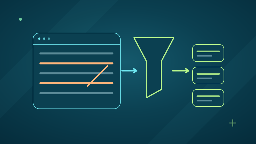
A survey dashboard should make it easy to establish whose answers a chart contains. Check the target population, collection period, recruitment method, question wording, and number of usable responses. A satisfaction score for people who used academic support answers a different question from a score for everyone enrolled. Labels should make the question base visible without requiring the reader to guess.
Distinguish the number invited, the number responding, and the number answering a particular item. Record whether displayed percentages are weighted. AAPOR's disclosure guidance covers sample recruitment, sample sizes, weighting, and methods, providing a useful reference for the information that should accompany a report. A dashboard needs access to that context even when its front page is concise.
Choose segments that connect to decisions
Programme, delivery mode, year of study, and service use may be useful segments when they correspond to an improvement owner. Define them before analysing results where possible. Avoid collecting or exposing personal characteristics merely because a dashboard can filter on them. An institution should know why each segment is needed and how the resulting comparison will be used.
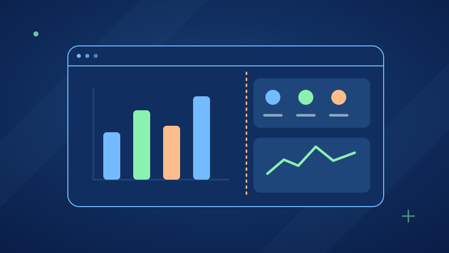
For an illustrative comparison of evening and daytime learners, show the response count for each group beside the measure. Check whether the groups differ in programme mix or stage of study. If the evening group contains mainly postgraduate students, a difference in support ratings cannot automatically be attributed to scheduling. Segmentation describes patterns; it does not by itself explain them.
Interpret uncertainty according to the sampling design
The US Census Bureau's statistical testing guidance explains that comparing ACS estimates requires considering their margins of error, rather than simply choosing the larger value. The same general discipline applies when reading survey comparisons: use uncertainty measures appropriate to the actual design. Weighting, clustering, and other design features can change the precision of estimates.
Do not attach a conventional random-sample margin of error to a voluntary survey merely because its response count is large. AAPOR's disclosure guidance requires measures of precision for nonprobability samples to be accompanied by their model and assumptions. Also consider coverage, nonresponse, wording, and processing errors, which a sampling-error interval does not capture.
Handle small groups and multiple comparisons deliberately
A subgroup with few responses can swing sharply when one person answers differently and may also create identification risks. Establish reporting and suppression rules with the institution before release. Where useful, combine periods or categories only when doing so preserves meaning. Show an insufficient-evidence message when a comparison cannot support the intended decision, and explain the next collection step.
Dashboards that offer many filters make it easy to discover striking differences by chance. Treat unexpected patterns as questions for follow-up and use an appropriate analysis plan before presenting them as established findings. Statistical significance also differs from practical importance. A small difference may be unimportant operationally, while a serious access problem may merit investigation despite limited survey evidence.
Check comparability before reading a trend
Before describing improvement between survey waves, compare the questions, scale labels, recruitment process, collection mode, and respondent composition. Pew Research Center's guidance highlights how wording, ordering, and mode can affect trend measurements. A redesigned question may create a discontinuity even when the dashboard displays its answers on the same time series.
Cross-country views require similar care. An institution comparing India, US, and UK cohorts should align the reference period and explain differences in programme structures and terminology. Keep a change log for survey versions and data transformations. If a comparison is only approximate, put that qualification next to the chart and state which narrower inference remains reasonable.
Connect each action to evidence and ownership
Convert a dashboard observation into an action record: the pattern, supporting question and base, plausible explanations, proposed response, owner, and review date. In an illustrative case, low ratings for finding assignment dates might lead to a navigation review and student walkthroughs. A later survey can assess reported experience, while operational checks confirm whether the relevant pages were actually corrected.
AI can help draft chart descriptions and suggest follow-up questions, provided a reviewer checks every claim against the underlying results. White Storm Technologies can build a custom survey reporting workflow with definitions, controlled segmentation, uncertainty notes, and an action register. The aim is a dashboard that helps education teams make proportionate decisions and see what additional evidence would change them.
Sources & further reading
Primary references checked for this article. Practical examples are illustrative, not client results.
Apply this to your project.
Talk to us about turning your survey or business data into useful findings, with data-quality checks, clear explanations, and human review of the conclusions.
Explore AI Data Analysis