Custom styling can make a survey feel familiar while making its controls harder to use. Accessibility needs to shape interaction design, dynamic routing, and error recovery from the beginning, especially when the project replaces standard controls with a distinctive branded experience.
HOW WHITE STORM WOULD APPROACH IT
A design you can explore.
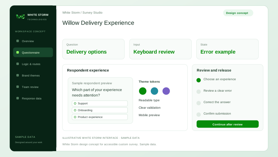
Illustrative accessibility review concept; fictional survey and sample states, not a certification or delivered client product.
Interactive design concept with sample data. This illustrates a possible project; it is not a delivered client system or an available AI product.
 WHITE STORMSurvey Studio
Willow Delivery Experience
Fictional retailer testing a branded, keyboard-operable customer survey.
Choose an experience
Read question guidance
Inputs, tool access, exception handling and acceptance criteria would be agreed with your team before implementation.
Estimate time and cost for your workflow
These editable figures are an illustrative scenario, not a White Storm quote or a forecast. Assisted work, review and expected rework are counted separately.
Enter all costs in the selected currency. Changing the label does not convert amounts.
At the illustrative defaults: 25 hours of monthly capacity, INR10,000 of capacity value after running costs, and an eight-month indicative recovery period.
Time capacity is not guaranteed cash savings. Real benefit depends on workload, quality, redeployment, integrations, licences, hosting, model use and maintenance. A negative result can favour a simpler configured solution.
Hours = monthly cases × (current − assisted − review − rework minutes) ÷ 60. Value after running costs = hours × loaded hourly cost − monthly running costs. Recovery = one-off costs ÷ positive monthly value.
Start with the difficult interaction
Consider a fictional retailer asking customers to compare delivery experiences. The proposed interface uses large illustrated cards, a progress animation, and conditional follow-up questions. A mouse-based demonstration looks polished, but it does not show how someone using a keyboard finds the selected card or learns that a required answer is missing.
We would identify the highest-risk controls before approving the design direction. These might include a draggable ranking, a dense matrix, an image-only choice, or a modal explanation. Request the actual research task and intended devices. A decorative redesign that obscures labels can increase participation effort even if the opening screen looks more distinctive.
Treat platform support as a starting point
SurveyJS documents accessible input controls and keyboard navigation. W3C's forms guidance explains validation feedback and notifications. Those sources support choosing established interaction patterns, but they do not certify a particular customized survey or remove the need to test its final configuration.
We would first explore standard controls within the existing builder. Native radios with a carefully styled label may achieve the desired card appearance without creating a new interaction model. A custom widget is justified by a necessary research task, not by novelty alone. Assess it with the same routes, translations, and validation rules respondents will encounter.
Specify a complete state model
Define how a control appears when untouched, focused, selected, disabled, invalid, and corrected. Include meaningful labels, instructions before difficult inputs, and a way to identify required questions. Selection cannot depend solely on color, and decorative product imagery should not replace the text needed to understand an answer.
For conditional content, specify where focus remains after an answer reveals another question. A newly displayed field should fit a predictable reading order. If changing an answer hides a follow-up, explain whether its stored value is cleared. That is both an accessibility concern and a data interpretation decision; it needs agreement rather than an accidental library default.
Design recovery as carefully as completion
A useful error message names the problem and gives a feasible correction. We would design an error summary with links to affected questions and inline messages that remain associated with their controls. Avoid discarding earlier answers because one field fails validation. A connection failure should offer a clear next step without falsely confirming submission.
The branded experience should retain legibility at increased text size and zoom. Long labels must wrap without hiding answer controls. Reduced-motion preferences matter when transitions are decorative. If a timer is proposed, investigate whether the research method requires it and how participants who need more time will be supported before adding it to the interface.
Create an acceptance matrix that people can execute
List the supported browser and assistive-technology combinations, representative devices, and exact journeys to check. Test keyboard entry and exit for every custom control, meaningful focus order, visible focus, question announcements, errors, and final confirmation. Check that the back action preserves the expected answers without trapping someone inside a widget.
We would combine automated checks with manual interaction review and, where scoped, testing involving people with relevant access needs. Researchers should inspect whether an accessible alternative measures the same construct as the visual version. Record failures with reproduction steps and acceptance decisions. A single clean automated scan is insufficient evidence for the whole respondent journey.
Keep research evidence distinct from interface testing
Fictional answers can test whether a control stores codes consistently. They cannot establish that actual customers interpret the question as intended. The pilot needs genuine participants, a documented recruitment approach, and review of confusing wording or interaction burden. Accessibility feedback from a pilot should be handled as design evidence, not silently converted into a population estimate.
Include the exported values in testing. A person who selects an option with a keyboard must produce the same answer code as a pointer user selecting that option. Distinguish missing, not applicable, and not displayed. An analyst should not infer preference from a field that a participant could not operate.
Budget for the experience you intend to maintain
White Storm Technologies would scope design, implementation, accessibility review, defect correction, and regression checks together. Custom controls create continuing obligations when a library, browser, theme, or language changes. Include hosting and support where a separate application is involved. If AI drafts markup, its output still needs interaction and semantic review.
The fictional interface concept illustrates a proposed design direction rather than a delivered or certified system. We would recommend configuration when native controls satisfy the task and a custom build only where the required interaction warrants its review and maintenance cost. Acceptance should describe observed behavior and unresolved issues without promising universal compatibility.
Sources & further reading
Research reviewed on 17 October 2026. Platform capabilities depend on version, plan and configuration. Primary references checked for this article. Practical examples are illustrative, not client results.
Apply this to your project.
Tell us about the people and devices your survey must support. We can develop and test accessible controls, mobile layouts, and multilingual question flows.
Explore AI Survey Design